
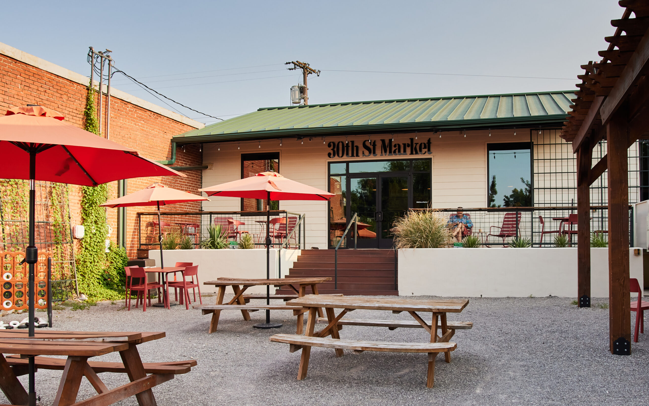
30th St. Market
Challenge:
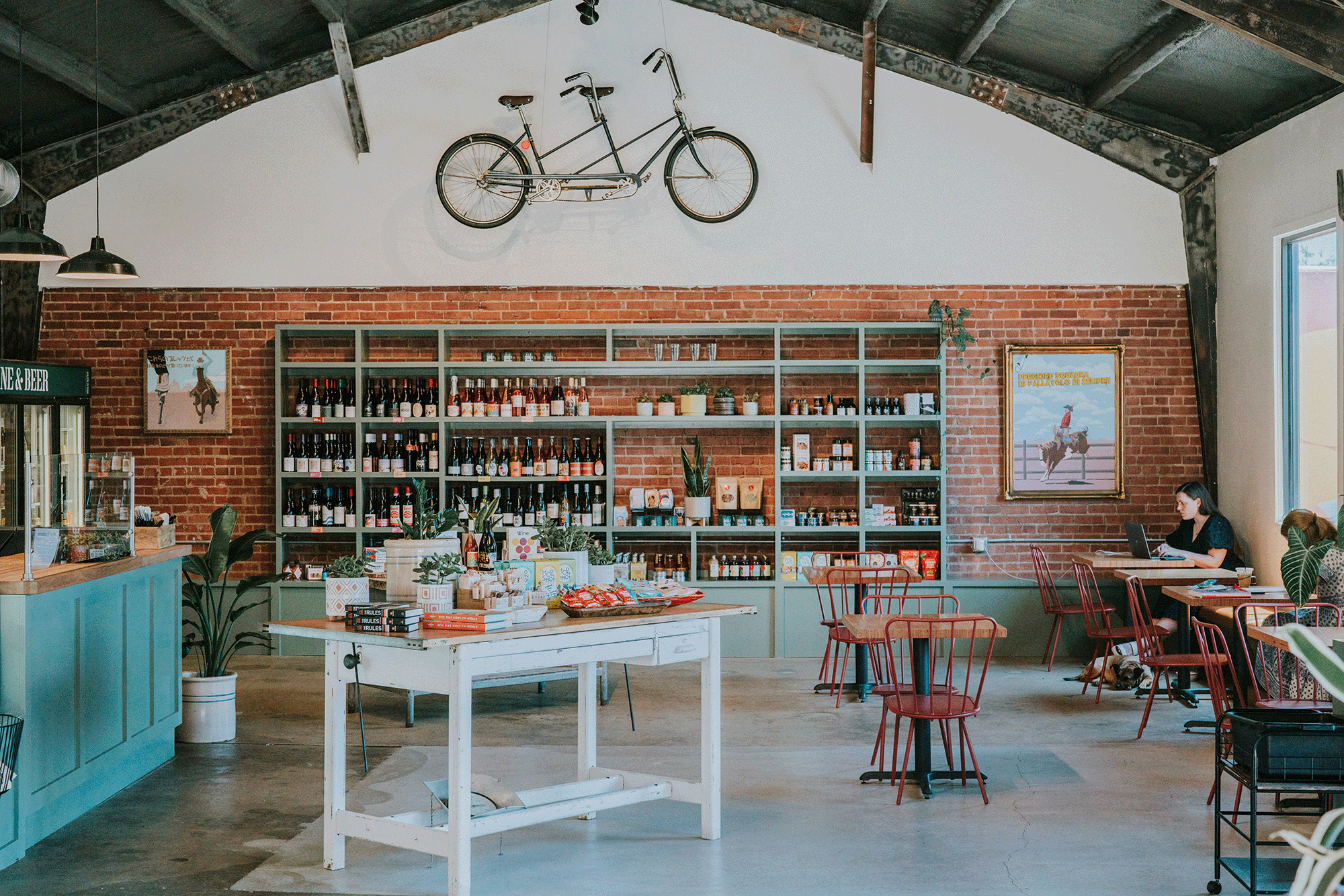
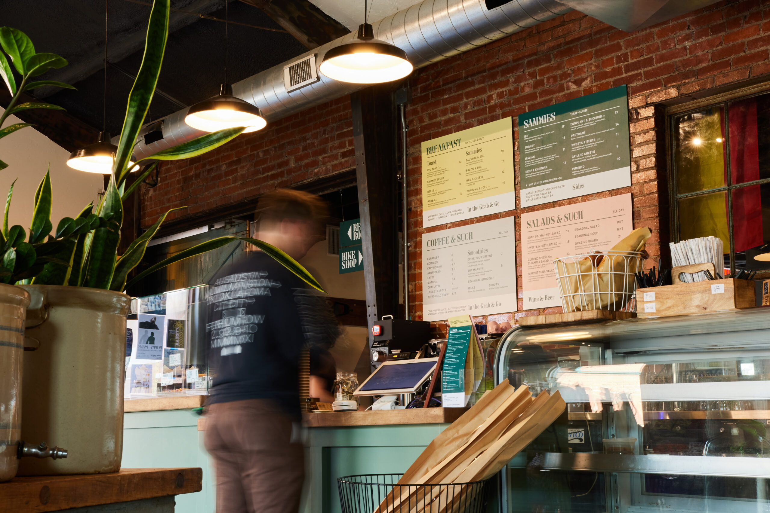
The owners dreamed of opening a utilitarian space that served the neighbhorhood it was tucked into. With a utilitarian name to match, the brand needed to align with the name and space, while still feeling warm to the surrounding community.
Opportunity:
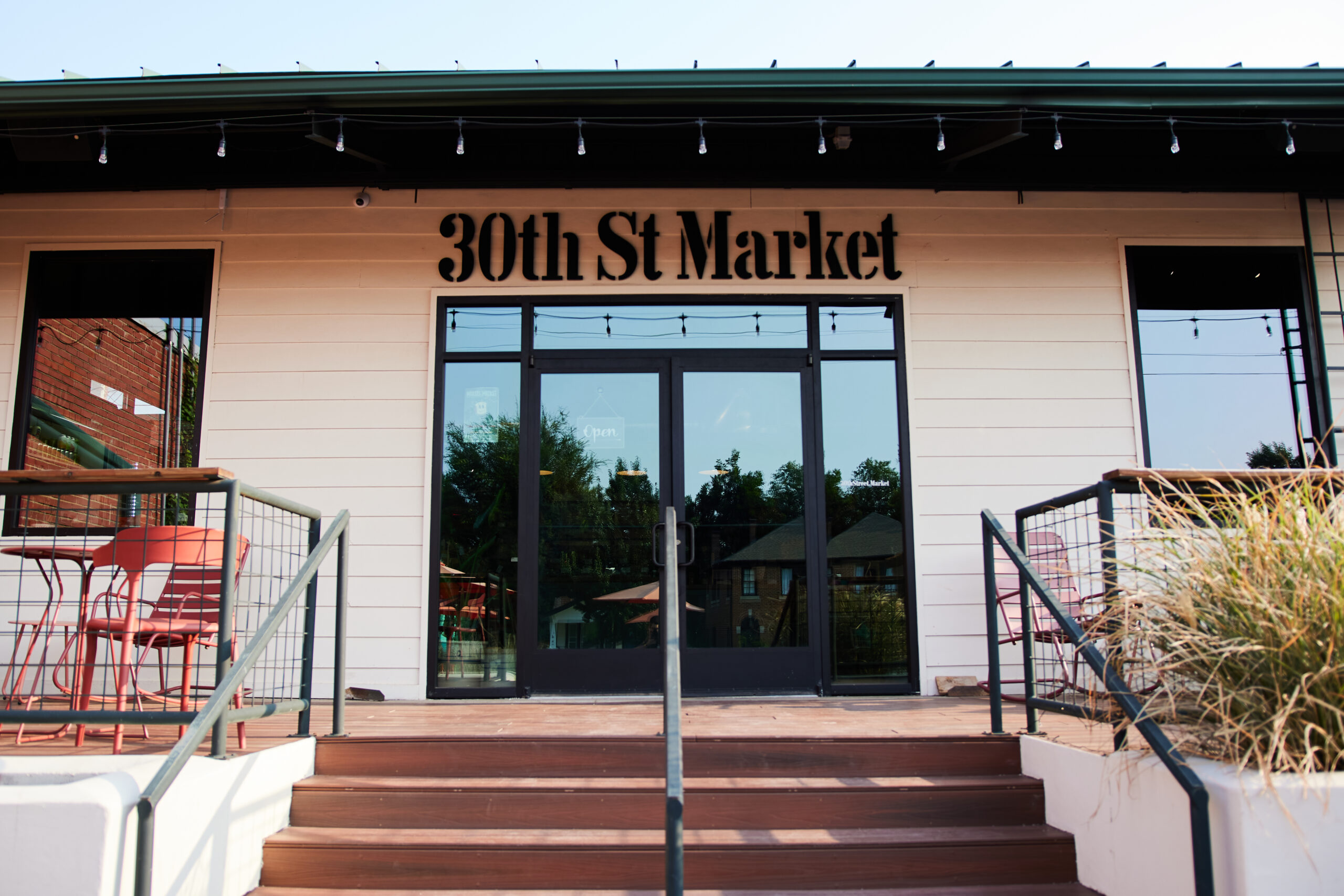
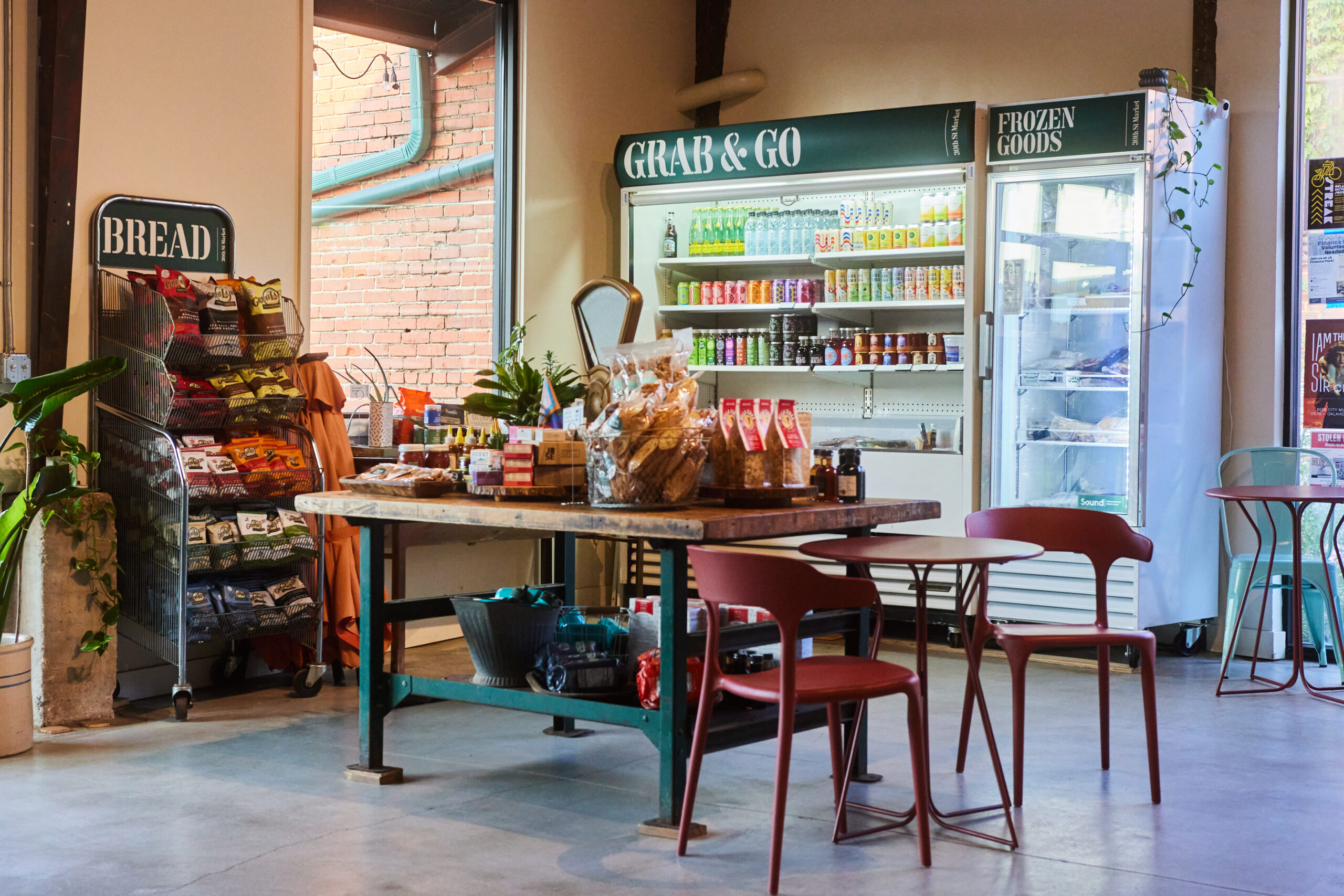
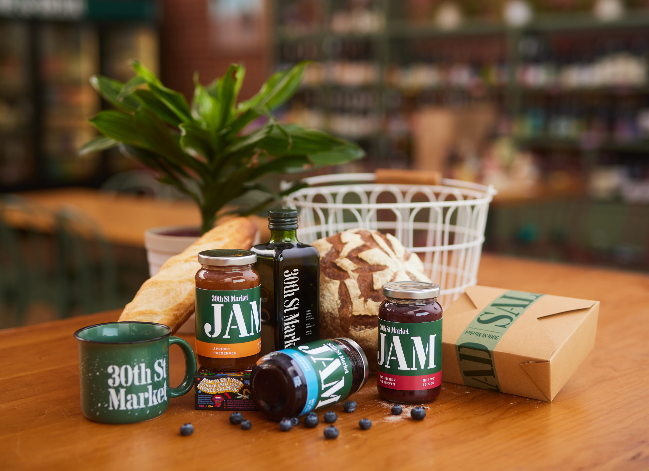
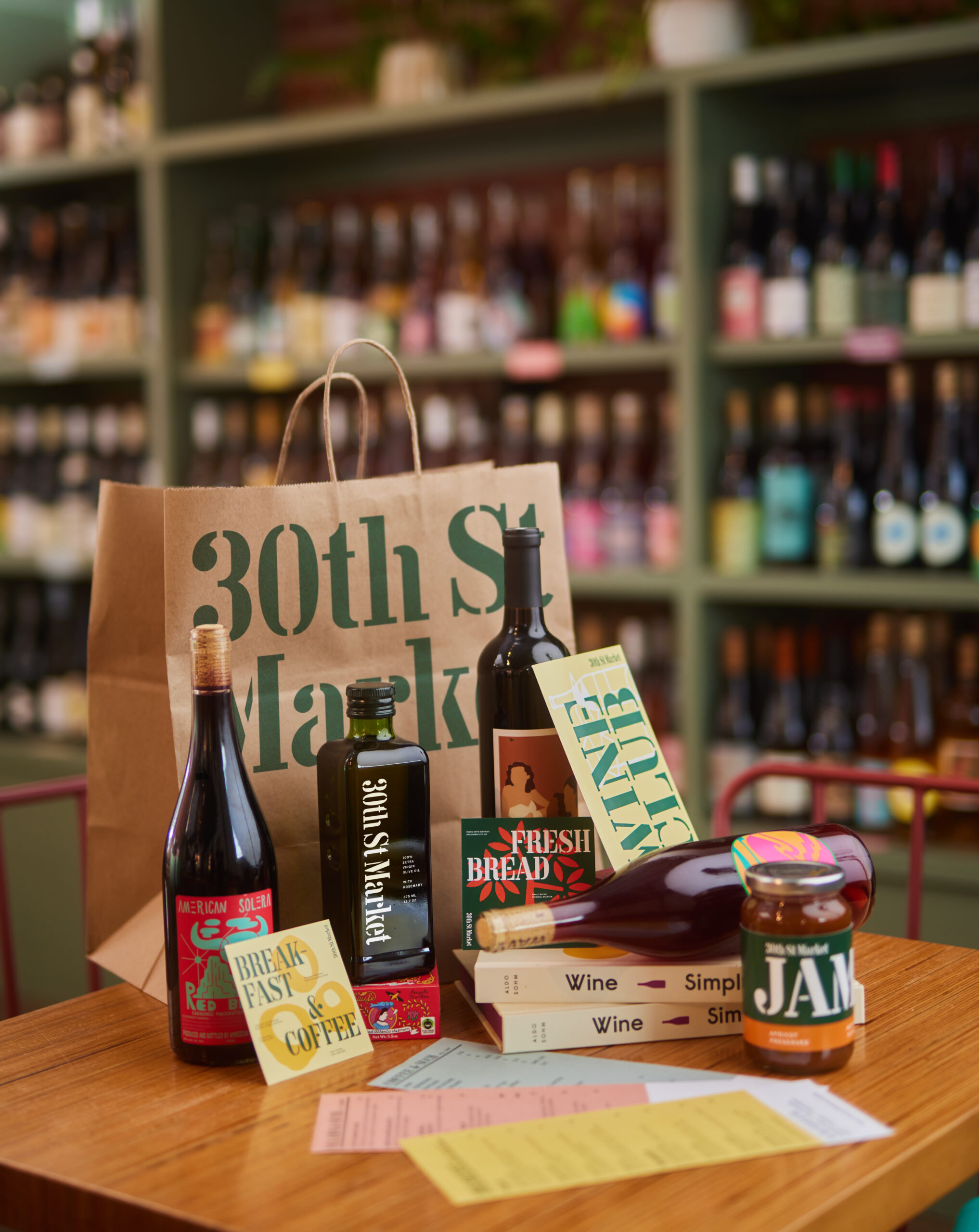
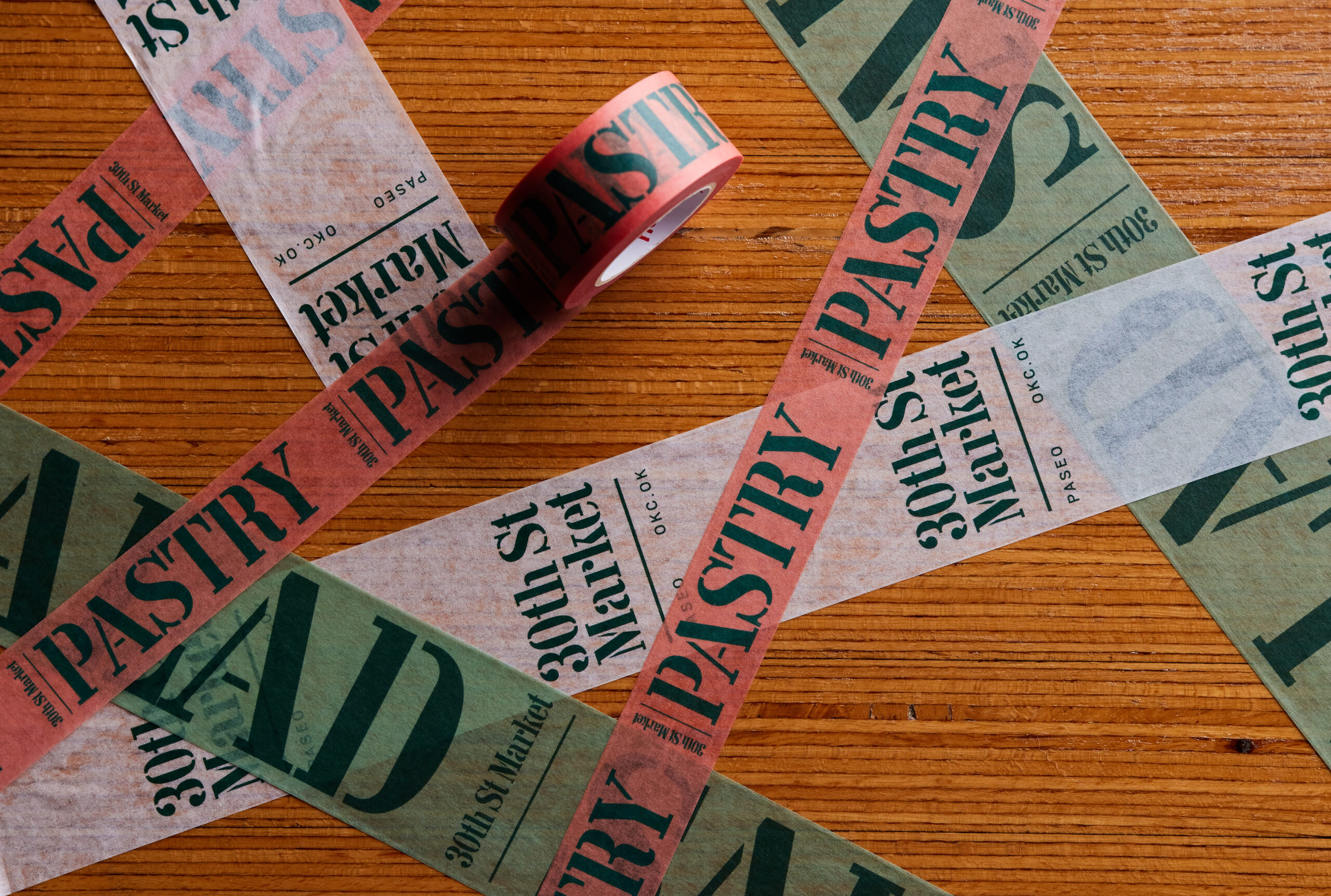
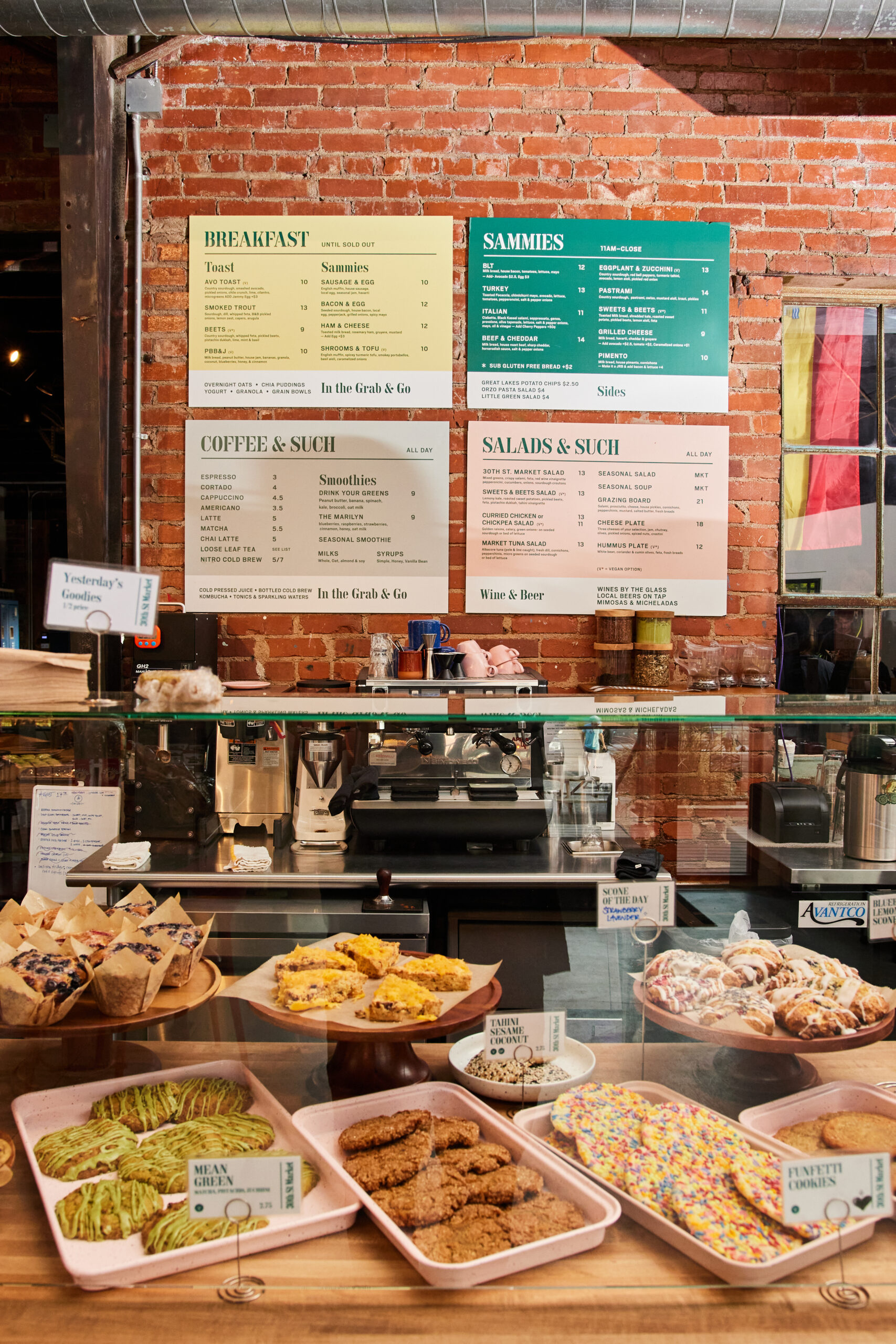
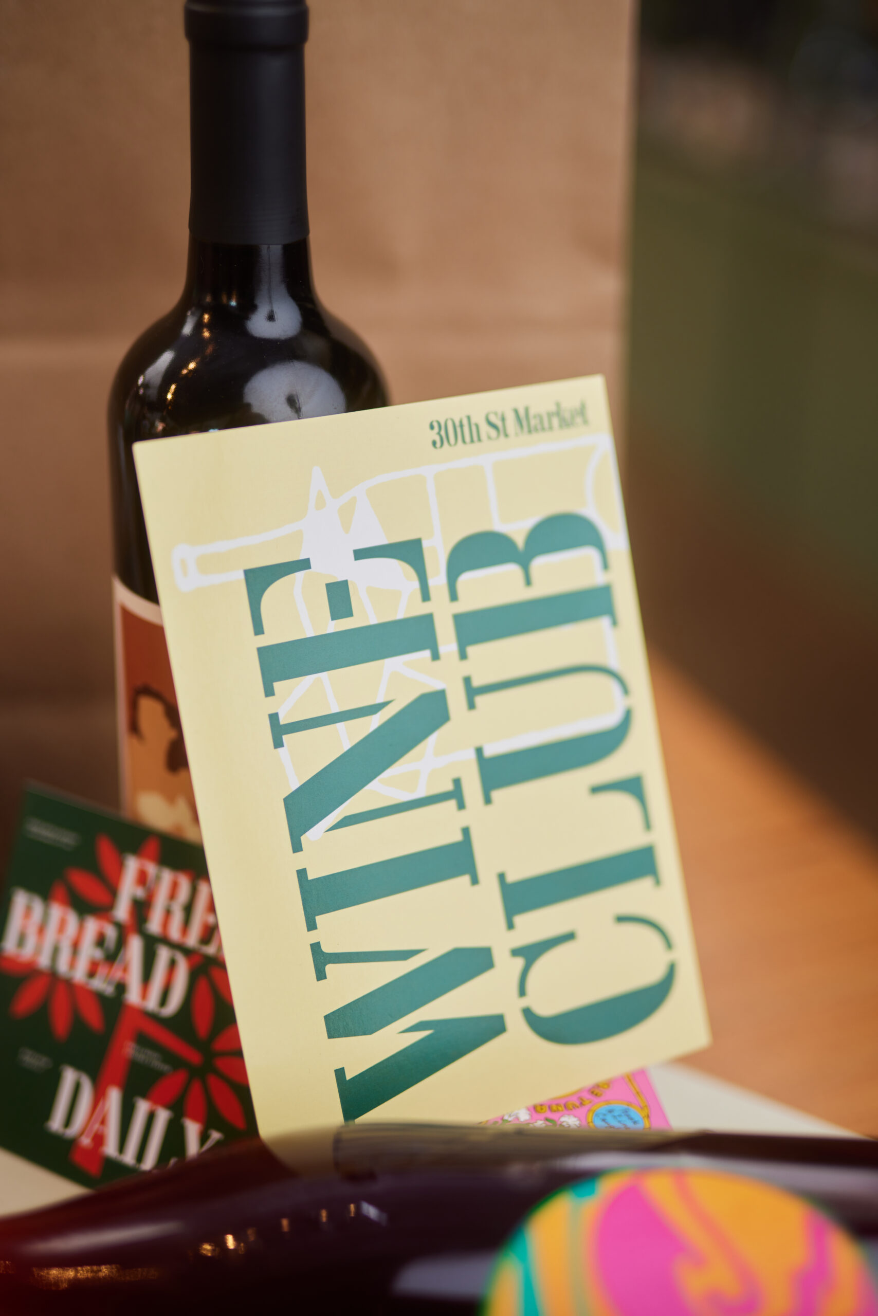
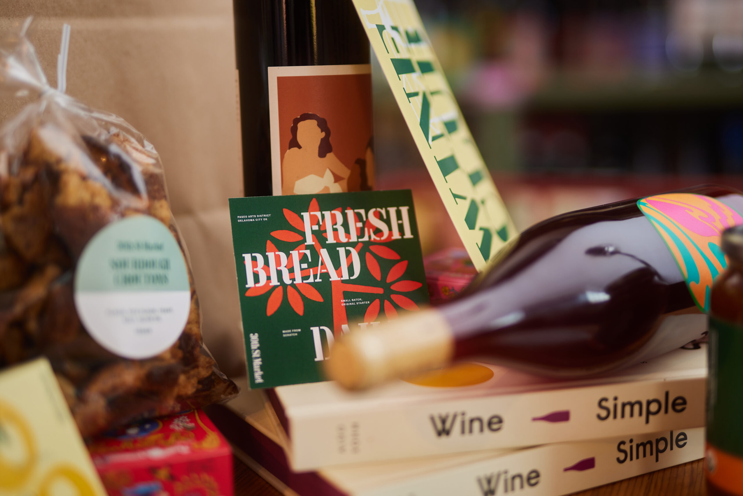
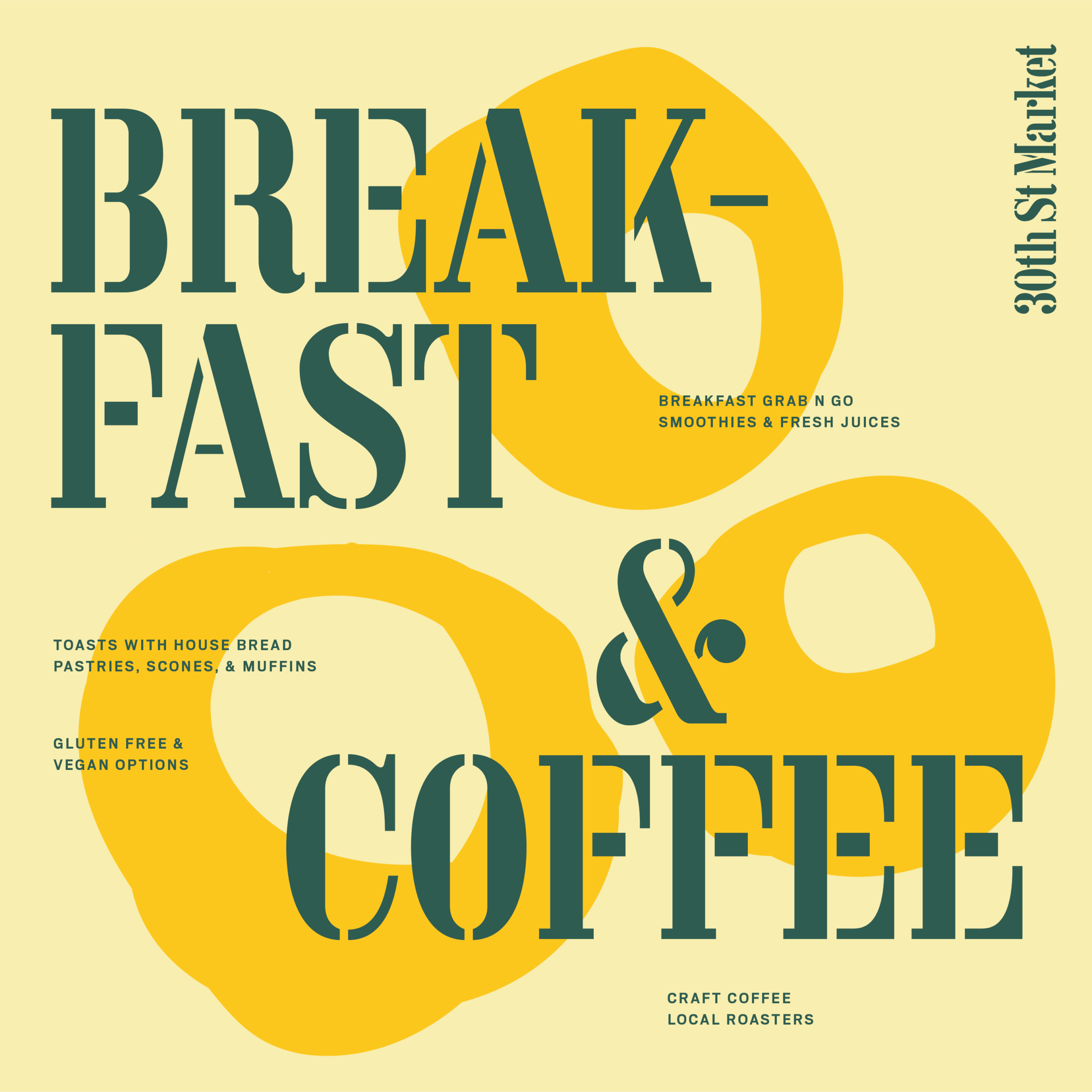
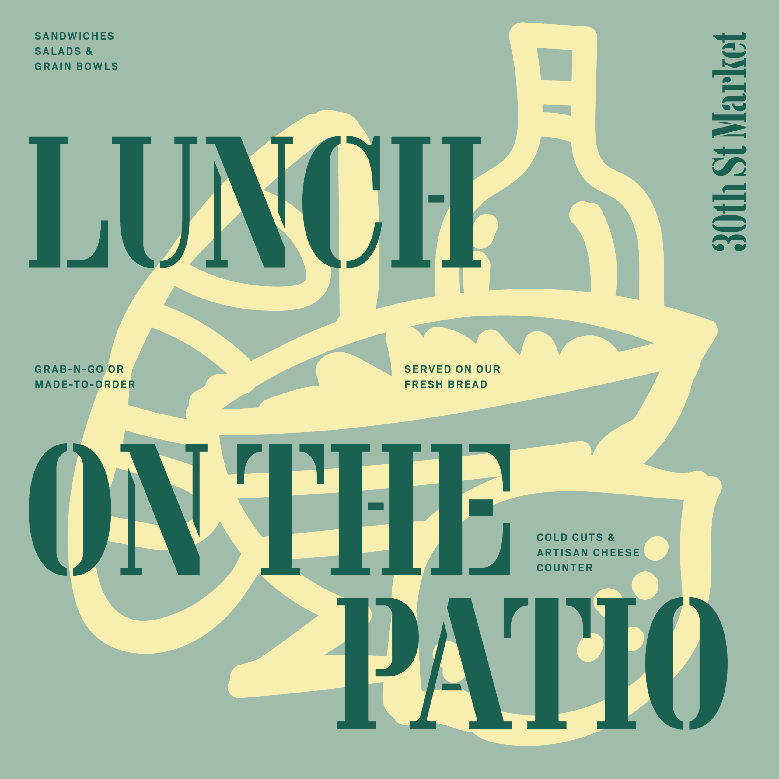
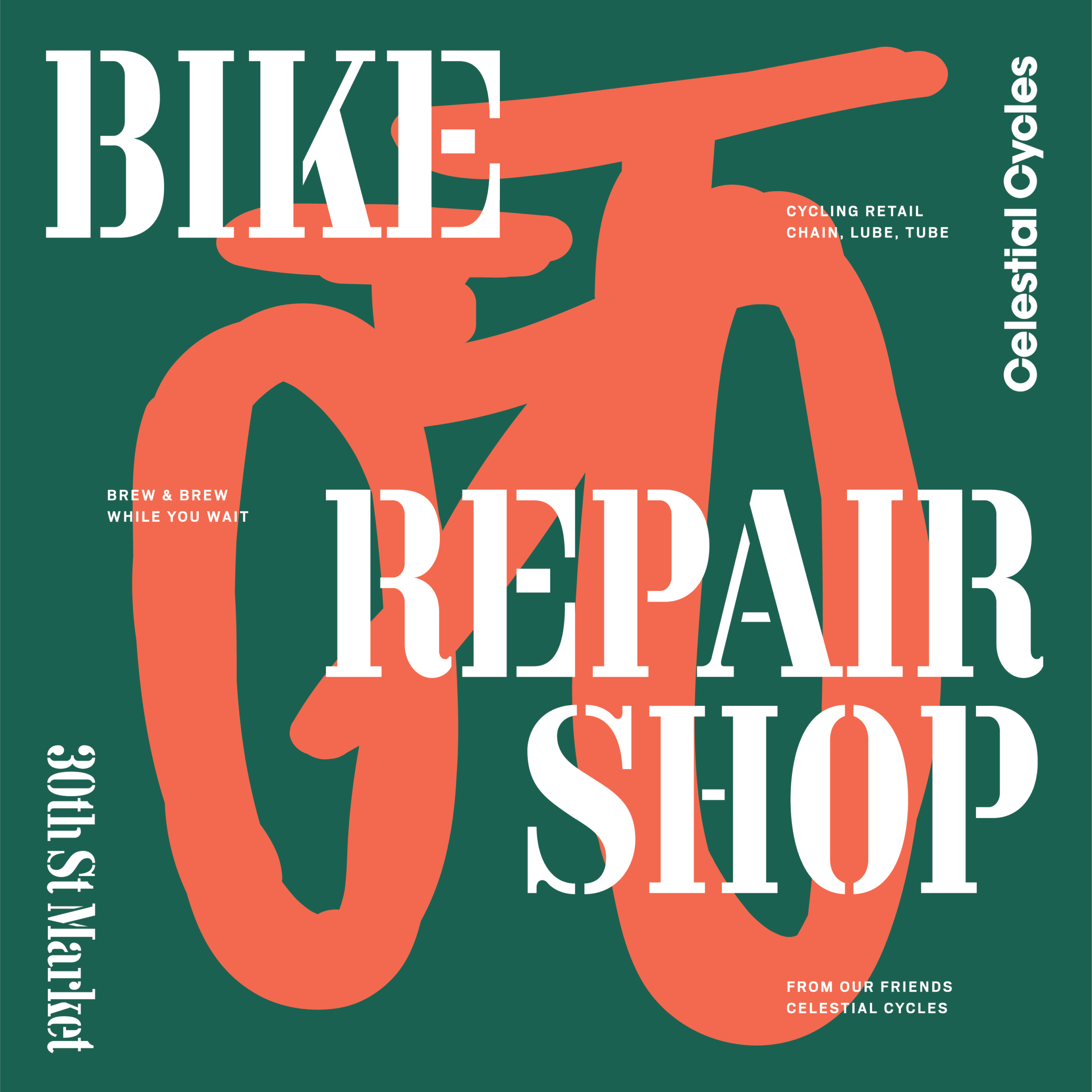
In the spirit of utility, a bare-bones type and color system is the "hero" of the brand. The primary stencil font carries the needed consistency across brand, signage, and packaging. Rooted in a hunter green, the color system brings the needed warmth alongide the utilitarian typography.
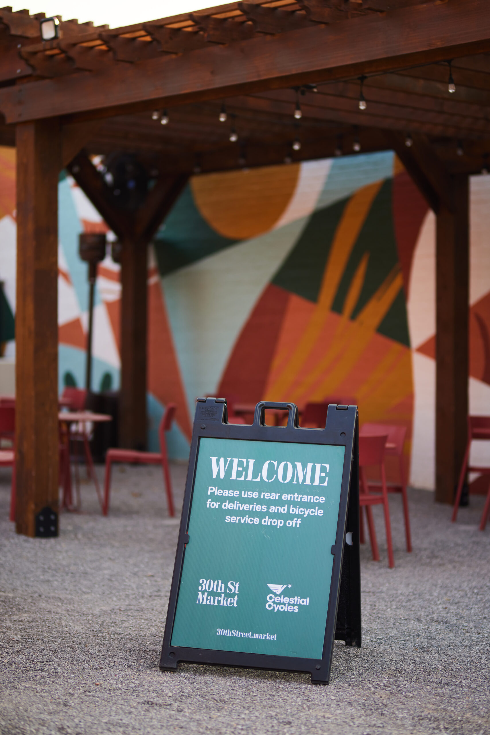

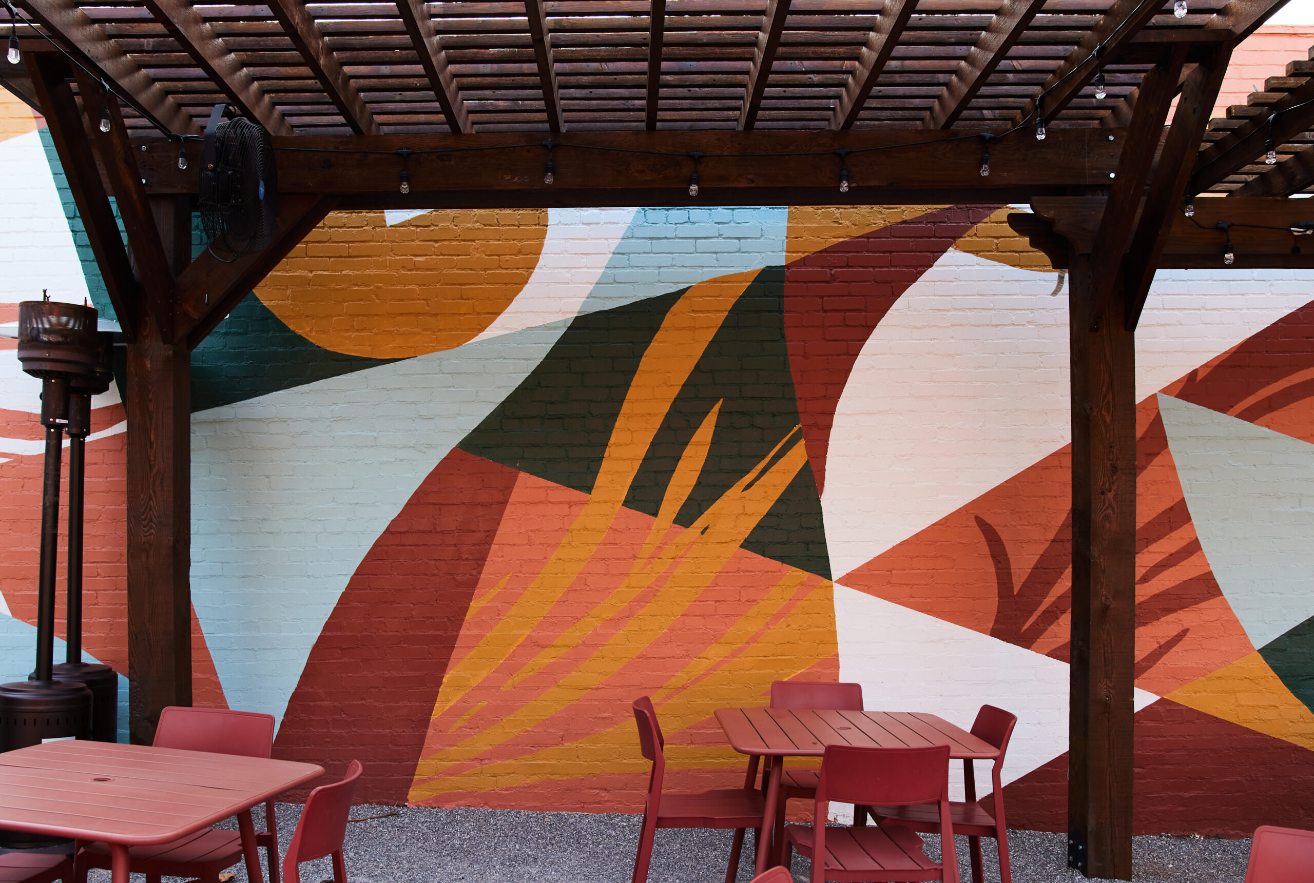
Mural install by staff and friends of the 30th St. family.